Feature Wall
Walls are the backdrop of spaces that we live, work and play in. They are very often the central element in the design of the interiors and impart a finished look.
Interactive Materials
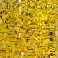
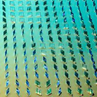
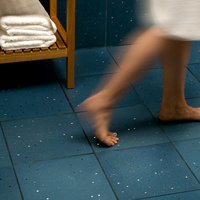
Customizable and interactive engagement of the senses by responding to touch, movement, color, light, and shadow in unexpected ways without the need for power or electronics. The surfaces of these material are smooth and easy to maintain.
Sensory Wall in a Hospital
“The Sensitile Scintilla was a catalyst for hands-on activity in the Kennedy Krieger Lobby. We selected the product for a vertical application due to its transmittance of light, sensory stimulation with light and shadow effects, smooth surface for easy cleaning, and its low-tech, high-impact results. Located at the check-in desk and lobby area helped to invite people into the space and immediately interact with the building.” Stanley Beaman & Sears, Atlanta, GA – Jennifer Wilkinson

Airport Lounge
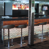
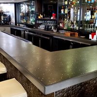
“We have selected Scintilla as a signature material for our airport lounges to highlight and bring to life certain feature areas often considered the “heart” of our spaces—primarily the bars and/or beverage serveries, which for many of our guests are a key focal point and destination area of the lounge. The dynamic, interactive nature of the material helps to activate and draw attention to the space, providing a backdrop to an engaging customer service experience with the bartender and other lounge guests. Also, we have leveraged the ability to specify different colors of the material to emphasize a branded consistency across the various tiers of our lounge products while at the same time differentiating between them” American Airlines – Mimi Chen
Light Filtering Materials
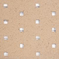
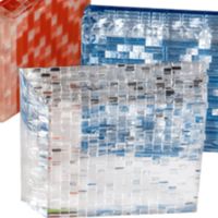
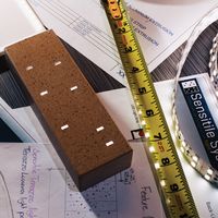
Light Filtering light-manipulating materials allow light to be captured, scattered, bent, and redirected, expanding the achievable aesthetic possibilities of traditional lighting methods. Panels and slabs in resin, glass, and terrazzo create an experiential surface -anywhere the interplay of light and shadow is needed for beauty, inspiration, and well-being
Public Art
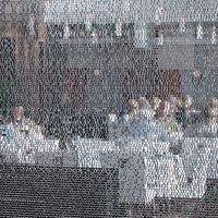
“The Sensitile Jali was custom laminated with a printed film image to create a glowing, framed artwork for the lobby of the San Diego Bayfront Hilton Hotel. The unique commissioned artworks are in front of a backlit lantern wall, so the light transmission quality was important. The image "distorting" quality created a mystery and a sparkle that a simple printed image would not produce, yet the printed image was very visible. The artwork creates a focal point for the lobby as well as a unique presence within the busy hotel lobby. The artwork was made in a custom size at the factory, and then put together on site to create the large 14' x 12' size for the artwork.” Norie Sato, Seattle, WA

Logo Wall
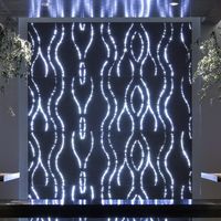
In this Huntsman Architectural Group design, the IP Soft logo is flawlessly integrated within a custom Gradient pattern of light emitting points in our PIXA™ slabs. The Brand’s Logo is the “negative”, non-illuminated space of this bespoke design for the entrance lobby of the company's New York City offices. Effortless modulation of color of emitted light allows a color-changing effect to be achieved.
Heavy-duty z-clips are integral to panels and the energy-efficient LED lighting system is discreet. The clever solution is designed for easy installation and serviceability.

Place-making Feature
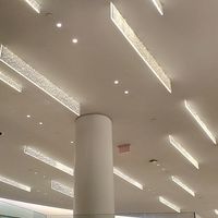
Designed by Pickard Chilton this imposing feature wall adds a magnificent elegance to the groundbreaking 609 Main office tower in downtown Houston. For a seamless installation, light-filtering Jali Cascata panels were stacked 30’ high with a forward lean, onto structural glass ribs to greet visitors into the main lobby. Washed from above with spotlights, the glowing feature transforms into a shimmering lantern at night. While during the day, the wall acts like a canvas, responding to the projected movements of those using the elevators and walkways behind the wall and connecting them to the rest of the physical space.

Branding Signage
“Sensitile has been a great addition to our client’s “branded materials palette” for many years. The dynamic nature of the material works well with the messaging that we want to convey through architectural design, the interaction with light is a nice tie in with our client’s connection to the fiber optic industry, and the fact that it comes in so many unique varieties has allowed us to “own” the look as something special that stands out and makes an impression on our customers, while also allowing for evolution and customization through many different applications.” Atmosphere Studios, Salt Lake City, Utah – Elliot Hansen
Light Emitting Materials
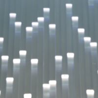
Light-emitting materials emit light from an unseen source in normally opaque or transparent substrates.
Brand Reception Wall
In this design by Stoiber + Associates, Spark panels were used as the brand feature wall behind the reception desk in the main lobby of the The Optical Society. The material, that uses internal optical pathways, to produce its distinctive, light-emitting effect speaks intimately to this 100 year old institution’s identity and purpose.

Waterless Water Feature
The Rockwell Group redesigned Chicago's Fairmont Hotel, whose main reception area features a waterless water feature.
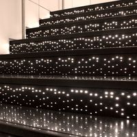
A custom pattern of light points was digitally translated into illuminated light points within the floor and wall tiles.
Fiber optic cables carry light from remotely-located illuminators that power the feature and are concealed behind the wall. The lighting system being separate from the material, that is designed to conduct light, makes for easy serviceability.

Residential Foyer
“We selected the Sensitile Lumina material to be applied in a residential foyer. It has completely transformed the residence and given both an inviting and calming feeling as you enter the home. The front doors have glass and therefore, as you approach the doors, you automatically see the beauty and sophistication of the Sensitile product. We applied the product above and below a custom floating foyer cabinet. As you enter the space you are immediately overtaken with the elegance of the product. The colors and design give a sense of calm to the room, as you enter the home. The intention of the product was to give a "WOW" factor as you enter the home, while still maintaining an inviting feel. It most certainly has achieved this. We used a number of lighting effects in the home, with this being the most dramatic and interesting for the first impression as a guest enters the home.”
Leslie Thomas
Options & Custom Services
Our experienced designers are experts at translating the design intent for a project into an easy to install and maintain solution.

Materials
Our wide range of materials offer options for a spectrum of designs

Colors
A “match” is likely to be found among our standard colors. Color matching service is also available.

Finishes
Finish affects color perception and is a specifiable feature.

Z-Clips
Integrated, invisible hardware for a “frameless” aesthetic

Framing
The versatile materials are able to be framed in a variety of materials, each for a unique aesthetic.

Standoffs
Point supports are sufficient in some designs for a minimalistic appeal.

Channels & Lighting
Light bars allow lighting to be discreet but at the same time serviceable.


